Case Study · TFR Tracker · End-to-End Product Design
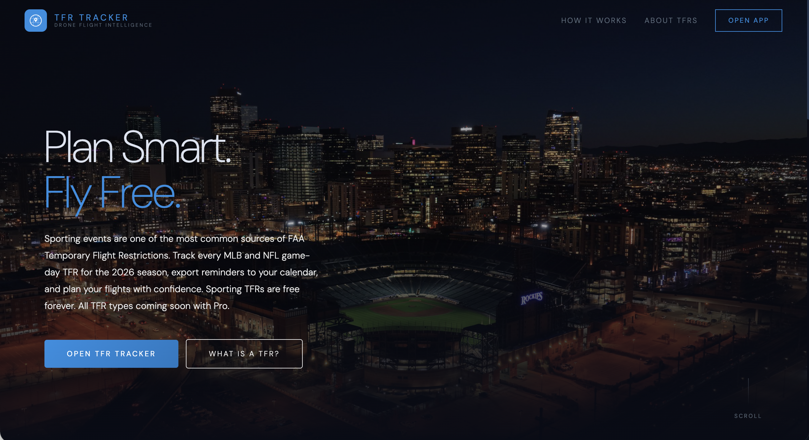
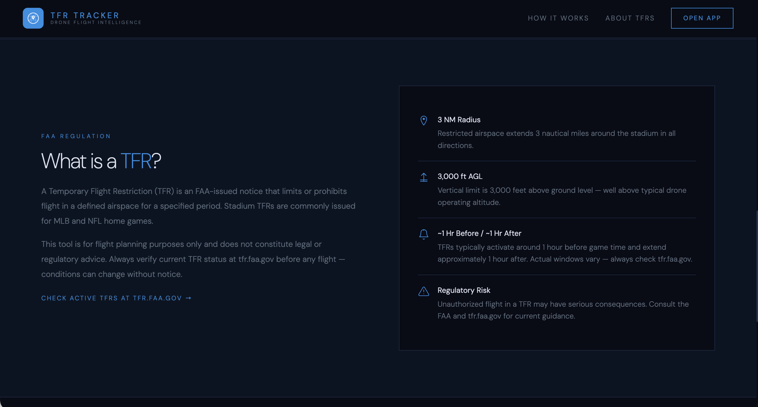
I'm a Part 107-certified drone pilot based in Denver. Coors Field is a 10-minute drive from downtown shoots I book regularly. Every home Rockies game triggers an FAA Temporary Flight Restriction - a hard no-fly radius that activates 60-90 minutes before first pitch, not at game time. Miss that window, and you're grounded on location with a client waiting.
I spent two seasons manually cross-referencing the MLB schedule against FAA NOTAMs before every shoot. The existing tools - ForeFlight, AirMap, the FAA's own TFR map - all surface the restriction only after it's been officially issued, sometimes just hours ahead. For a professional who plans days out, that's too late. I built what I needed.
The gap isn't awareness - it's proactive planning infrastructure. Every drone pilot knows TFRs exist. None of them have a tool that puts TFR windows into the same calendar they already live in - before the trip is ever booked.
I mapped the failure point with precision: friction doesn't happen at the flight, it happens three to five days earlier, when a pilot is scouting locations and blocking shoot windows. At that moment, no tool in the market answers the question they're actually asking - "Is this airspace clean on this date?"
Stadium TFRs follow a completely predictable pattern: the FAA issues them on a fixed schedule tied to league game times. This meant the restriction windows could be calculated and pre-loaded, not fetched live. That single insight unlocked the entire architecture.
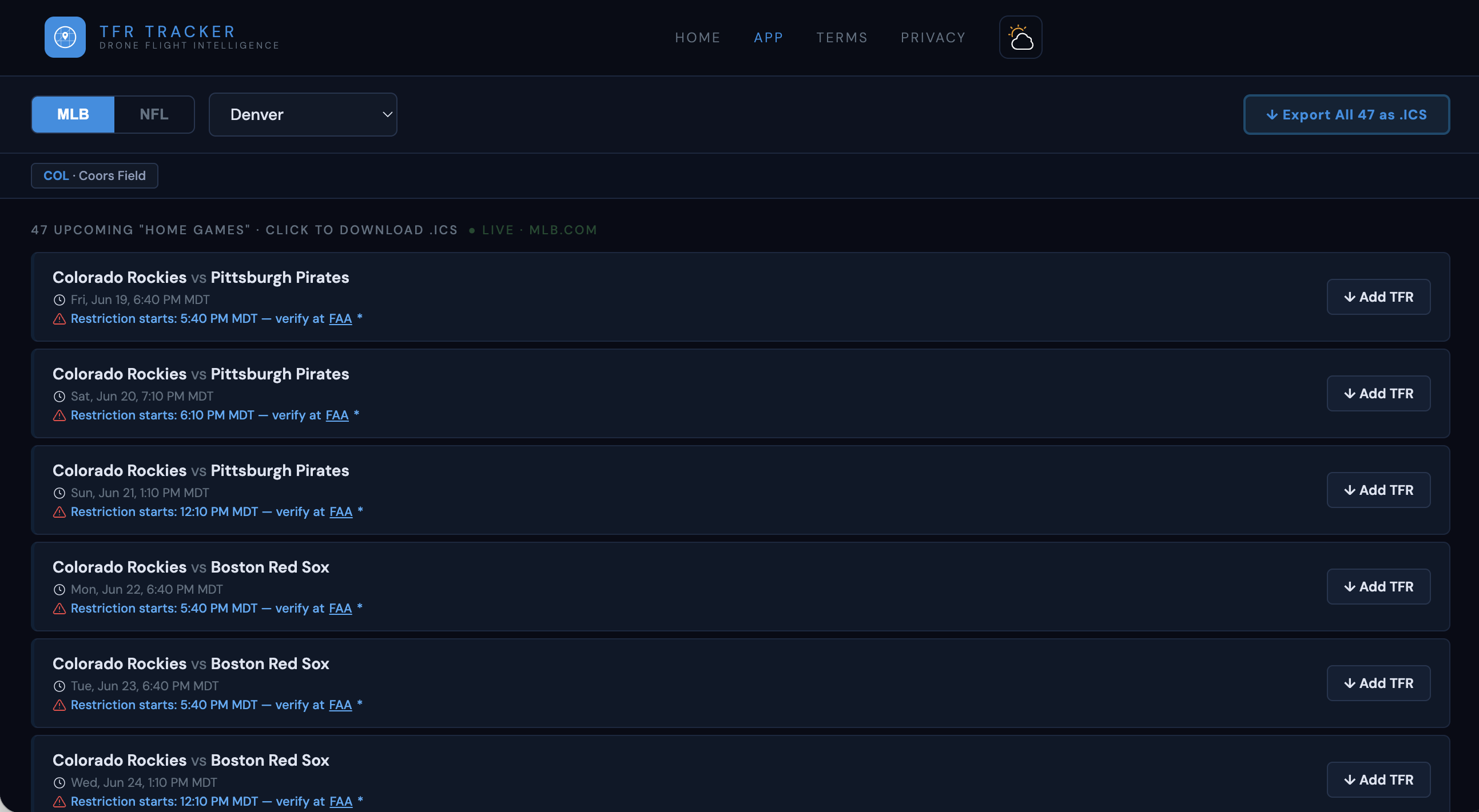
The wireframes enforced a single constraint: every interaction should be answerable within two taps. Select your city. See your TFR windows. Export to calendar. Everything else was noise and cut.
The dark interface was a functional decision before it was an aesthetic one. Drone pilots do preflight planning at dusk, in vehicles, on phone screens at high ambient brightness. High-contrast navy anchored to #080c16 reduces glare and ensures readability in conditions where a white interface would actively impede the user.
Color carried semantic load throughout the UI. Accent blue (#1C8FE3) appeared only on actionable elements and active TFR warnings. Green only appeared on saved states. DM Sans at weights 200-400 gave the UI an instrument-panel precision - readable at small sizes, low visual noise at high data density.
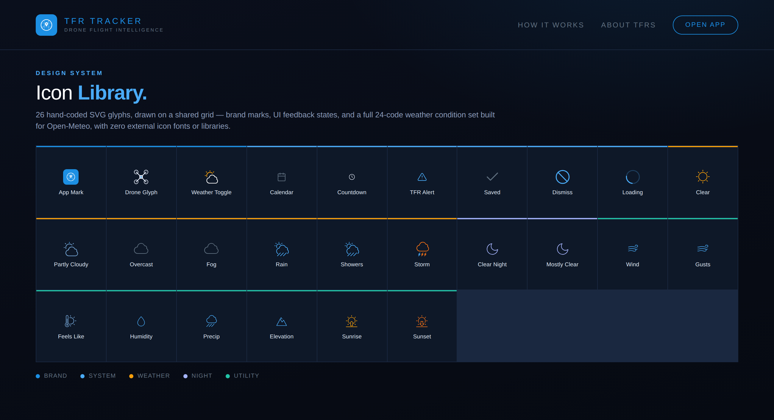
Every icon in the product is hand-coded inline SVG - no icon font, no external library, no image sprite. That decision followed directly from the "no runtime dependency" architecture constraint: an icon font is a network request and a flash-of-unstyled-content risk at exactly the moment - 5am, spotty parking-garage signal - the app can least afford it.
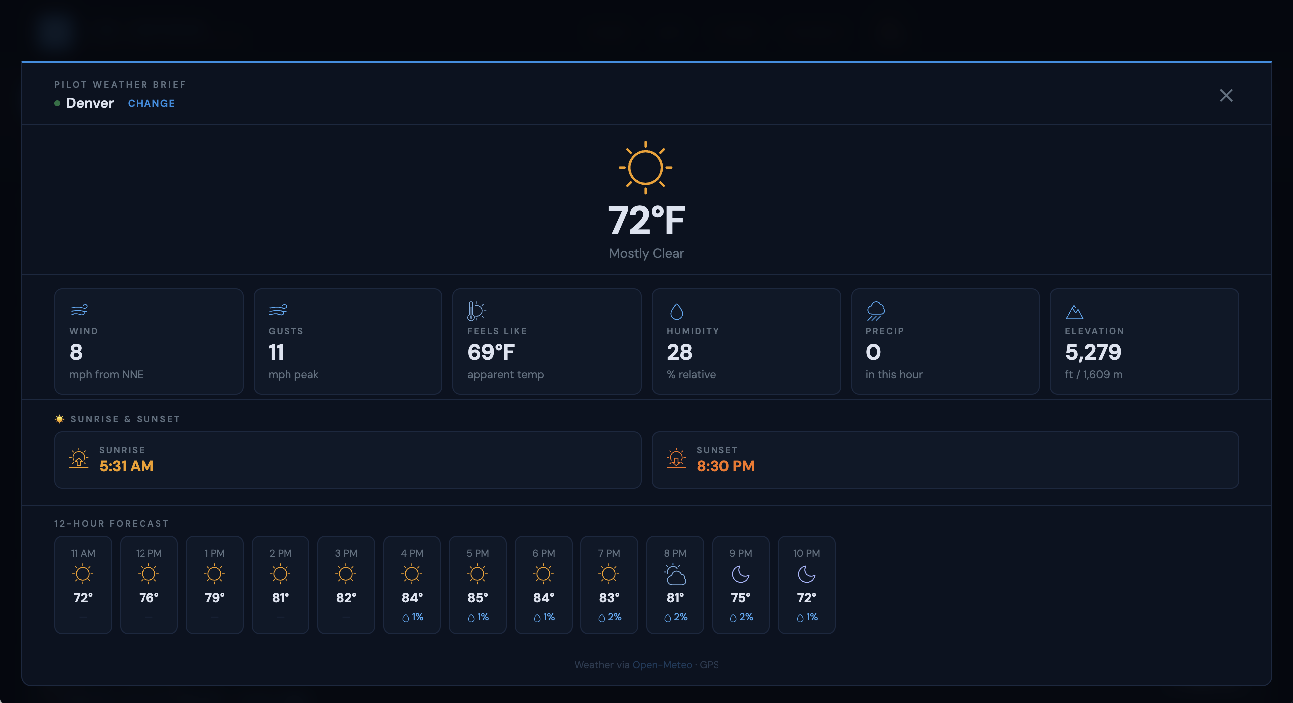
The weather module needed its own condition-icon set mapped to Open-Meteo's 24 WMO weather codes, plus day/night variants. Rather than pull in a third-party weather-icon package, I drew the full set as raw SVG path data on a shared 24x24 grid, so every glyph shares the same stroke weight, corner radius, and optical size as the UI icons around it.
Color does the labeling so the copy doesn't have to. Amber reads as sun and daylight. Indigo reads as night. Blue is the product's own accent, reserved for primary actions and active TFR state. Gray is neutral chrome. A pilot scanning the weather brief at a glance never has to read a label to know what condition it's showing.
Every glyph on this page is the live production SVG - not a redrawn approximation - pulled directly from the app's source and rendered here at true size. Inlining icons as SVG also meant every glyph could inherit CSS - stroke color, opacity, even the spinner's rotation - straight from the design token system, with zero additional asset weight.
The entire 2026 MLB season - 2,430+ home games across all 30 teams - is compiled into a single static HTML file using React (JSX). Schedule data was pulled from the MLB Stats API at build time and baked in. No server. No database. No runtime API calls. The app ships with everything it needs, loads instantly, and has no dependency on third-party uptime or rate limits.
The .ICS format was selected because it integrates natively with every calendar a pilot already uses - Apple Calendar, Google Calendar, and Outlook all handle it without installation. The TFR window, venue, and advisory notice are encoded in the event description.
After launching with MLB, the app expanded to cover all 32 NFL franchises for the 2026-27 season, then added FIFA World Cup 2026 host venues across the US, Mexico, and Canada - three aviation authorities, each with different TFR protocols, surfaced through a single unified interface.
Each league expansion required researching the specific TFR issuance pattern for that sport. MLB restricts 1 hour before first pitch. NFL restricts 1 hour before kickoff. World Cup venues trigger expanded 3 NM restriction areas. The data model accommodates these differences without any complexity leaking to the user.
After shipping the product, I documented the entire visual identity as a standalone brand guidelines page - color tokens, typography scale, logo system, UI component patterns, motion values, and voice standards. All values were extracted directly from the production source files rather than approximated, so the document serves as both a reference and a living spec.
The guidelines cover the expanded token set added in the app's second version - including the new controls palette (--ctrl, --chip, --border2), the secondary text value for badge content (--muted2), and the saved-state green system. Documenting the system forced useful clarity on what was intentional versus incidental.
